Aaah, yes, it’s that time of the year again. The time to write about Pantone’s Color of the Year. Last year’s color was called “Greenery” and it was all about green, everything green and green is gorgeous. This year they’ve leaned towards to the opposite side of the spectrum, Purple.
To be exact, Ultra Violet. I’ve never been a huge fan of purple but I must admit, this color in particular is starting to grow on me. It reminds me of Crocus popping up through the snow, signaling that spring is near. And who doesn’t like that?
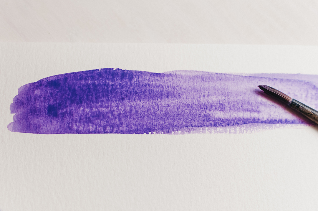
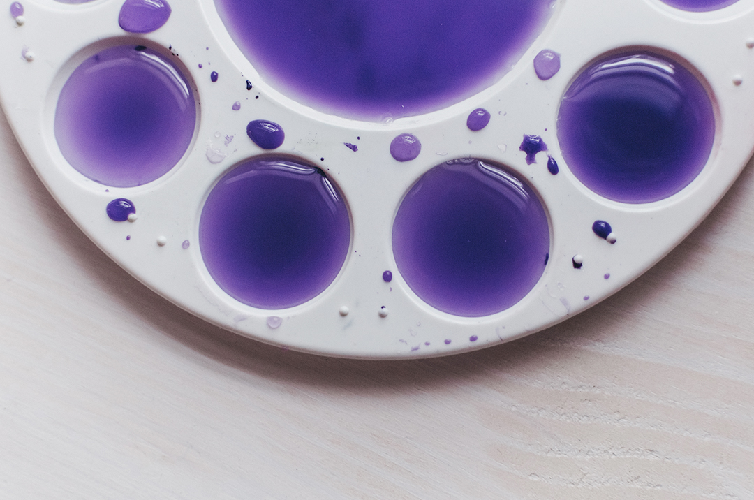
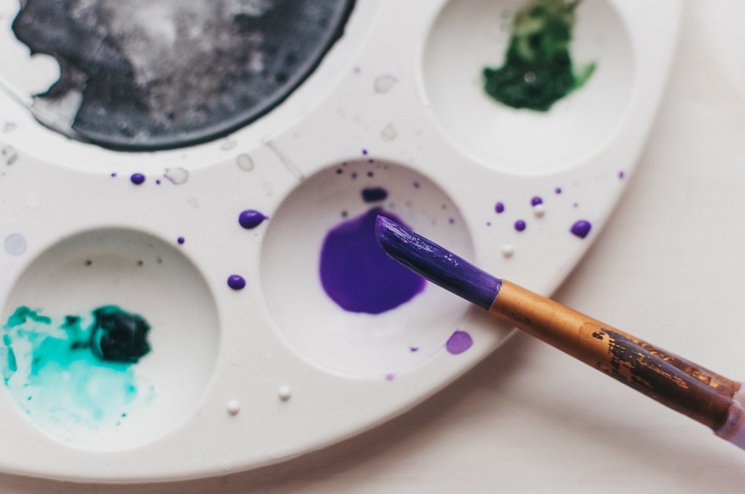
I took out my messy watercolors, played around and snapped a few photos. I think if Ultra Violet is used sparingly, it can remain tasteful without overwhelming your design.
For you designers, the color codes are:
RGB 95 75 139
HEX/HTML 5F4B8B
Click here for more information about Ultra Violet on Pantone’s website.
What do you think of Pantone’s color choice for 2018? Feel free to share your thoughts below.
